
MyRoomie
An app for finding a roommate
Human center design /VR / UI/UX Design
Team:
Xueer Xia
Erik Soriano
Role:
UX Researcher & Visual Designer
Visual Designer & UX Researcher
Tools:
Figma
Google JamBoard
Microsoft Office suite
Summary
An application made for int’l students to find a roommate and a place to live, either separately or simultaneously. Introducing an innovate and forward-thinking way to communicate living preferences by allowing users to put their living style habits by using images alongside text; they can select images for aspects of the living experience such as smoking habits, party habits, cleanliness, visitors, social habits, study habits and more. The intent of the app is to give users a clearer snapshot of their roommate options first, so they can get a better idea of who they can message to save each other time.
The app also allows standard features such as private message, group chats, and the ability to join 3D simulator that puts users in different housing conditions that serve as prompts to further expand on conversation regarding how they would interact if they lived together.
Introduction
Going to college is already a big and overwhelming decision for many students, but for Int’l students who decide to study abroad, this experience includes a new set of challenges to overcome; from learning a new language, to learning new rules and laws, to adapting to a new city, lifestyle and learning to become independent, aside from their school duties, and of course…finding somewhere to call home.
Our team decided to figure out exactly which is the most difficulty part for expats after getting accepted into their dream school, so we started with generative research methods to understand the student experience.
1 online survey (remote/unmoderated)
Participants were recruited from countries such as China, Singapore, Norway and the US.
10 1-on1 interviews (remote/moderated)
Our original assumptions were that students mainly cared about finding affordable housing options, as well as short distances to school and also that they would like a platform where they could ask questions to other students about how to adapt to a new culture/country.
Generative Research
Original Problem Statement:
“How might we innovate on the experience of finding a place to live for Int’l students”
Synthesis
We gathered the most important data points from our 10 user interviews, and organized them on a different page, 1 per participant. We also extracted the most important takeaways to help us identity themes and clustering later on. These are some examples of the affinity diagrams that helped us narrow down our path to choose an area to innovate.


Insights


Students seek information online on social media outlets such as WeChat, Facebook, etc.
Students seek housing + roommates online
Students who prefer lower prices have to worry about furniture & utilities
Students struggle to find roommates they can trust
Students struggle to find housing alone, so they opt to find roommates to facilitate the house seeking experience
Expats look for roommates at the last minute before traveling abroad.
Students do not trust the information they find online, due to fear of scamming
There is uncertainty when trying to secure a place to live, especially when students do it alone
User Personas
After our data synthesis and scoping down our higher level findings to focus on the opportunity to innovate on the roommate seeking experience, we developed two personas: Candy Jones & Jenna Sander, who represent our two user groups, both are International students who have different motivations for finding a roommate. They helped us stay on track and having a good reference point when developing our solutions and ideas.


User Journey Map
By empathizing with both personas, and getting an idea of their journey from getting accepted into the school, all the way to arriving at their new city, we plotted all the different pain points and satisfactory moments of their experience, the most pain points occurred when browsing online to meet people to live with, since there is so much uncertainty and bias from previous bad experiences, etc. This was our opportunity.


Reframed Problem Statement:
“How might we facilitate the experience of finding roommates before finding a place to live by allowing users to connect and get to know each other first?”
Opportunities For Innovation
Insight statement:
“Expats look for roommates at the last minute before traveling abroad”
1.How Might We innovate on expats finding roommate candidates on short notice who prefer someone who already has a place?
2.How Might we facilitate conversation about living preferences between potential roommates?
3.How Might We innovate on communicating specific needs of roommates without relying much on text content?
Participant Voices:
“Then I posted on Weibo, and then someone else came to add me. At that time, we seemed to have two or three new students. And then after the addition of the freshman group, there was a freshman he knew another person”
Solution
Create a platform that allows users find a roommate and a place to live simultaneously.
Opportunities For Innovation
Insight statement:
“It’s difficult to find the right roommate”
1.How Might We facilitate seeking a compatible roommate for expats so that they have enough info to guide them to contact the person and move forward?
2.How Might we facilitate conversation about living preferences between potential roommates?
3.How Might We innovate on communicating specific needs of roommates without relying much on text content?
4.How Might We innovate on experience of seeking roommates for expats who just want to share the rent?
Participant Voices:
“Well, it's what you want you to choose, but you don't know, and you can't choose your roommate. I just don't know it at all, I don't know it until the second you check in”
Solution
Allow users to find a compatible roommate by showing them profiles that use mainly visual cues such as photos, icons and video rather than just words.
MyRoomie App

An application made for int’l students to find a roommate (roomie) and a place to live, either separately or simultaneously. Users can communicate living preferences by selecting from a list of parameters and using images alongside text; they can select images for aspects of the living experience such as smoking habits, party habits, cleanliness, visitors, social habits, study habits and more.
A picture is worth a thousand words.
People can learn more by seeing images, than by simply reading words on profiles (sometimes people don’t even write bios, so it’s hard to get an idea of someone’s personality). The intent of the app is to give users a clearer snapshot of their roommate options first, so they can get a better idea of who they can message to save each other time. The app also allows standard features such as private message, video-chat and the ability to join a 3D simulator that puts users in different housing conditions that serve as prompts to further expand on conversation regarding how they would interact if they lived together.

Main Target Audience:
Int’l students who want to find a roommate to have an easier and better school experience
Students who’s had roommates before or those who’ve never had a roommate but are open to the idea
Key Features:
Ability to select from ‘levels’ of living preference instead of binary options such as clean/messy
Ability to join optional living simulator that creates prompts for conversation regarding how people would share common area
Ability to find place to live simultaneously as finding roommate options
Ideation:Sketches
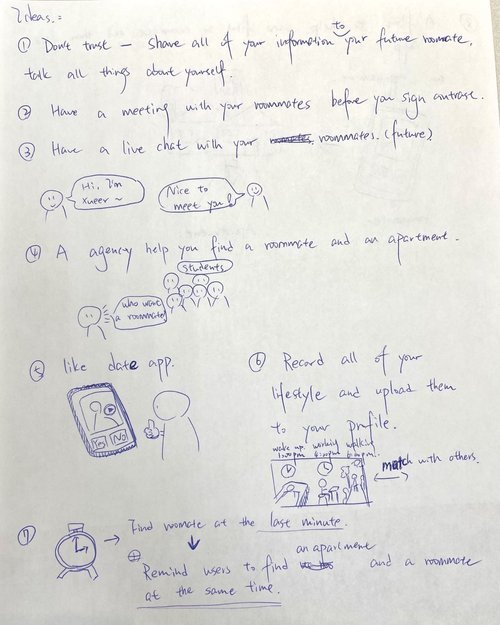
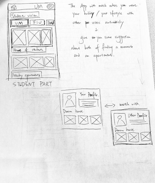
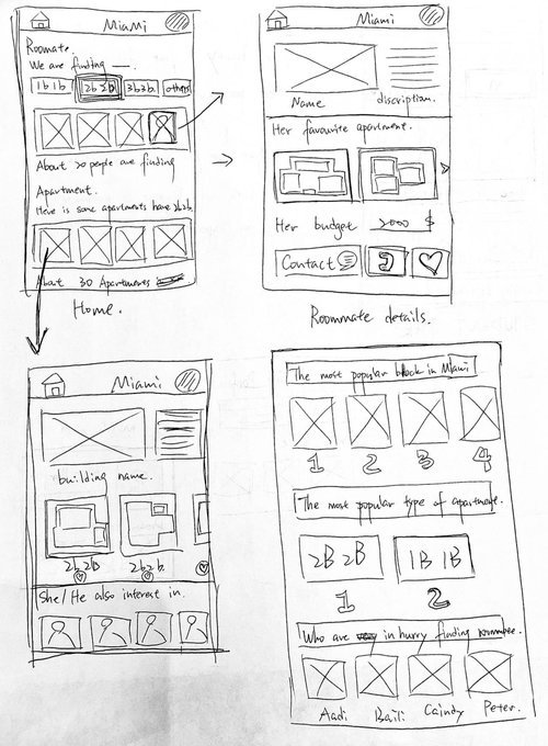
During the ideation process, we considered different ways to communicate someone’s personality and living habits beyond words, we thought of solutions such asa Roblox-like experience where users play a game to simulate what it’s like living together, as well as a virtual reality experience that also takes players to several scenarios where they choose to interact with roommate (or not), but we realized having to have a headset would not be so easy for most people worldwide, so we needed a simpler, more ubiquitous solution: a mobile app experience.
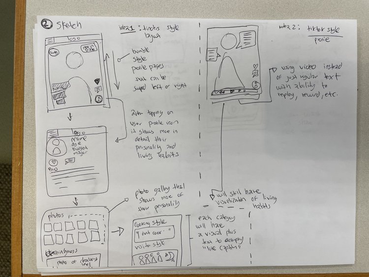
After deciding to move forward with the mobile app experience to seek roommates, we needed to innovate on more ways to communicate information if users did not write bios, or for those users who are more visual and do not read text otherwise. We felt confident that our idea to use icons and visuals to communicate words was not commonly done in current apps that cater to international students.
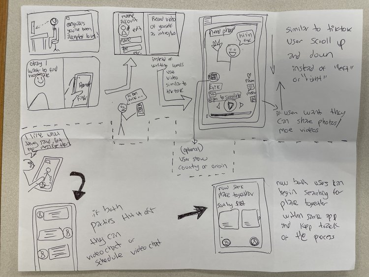
Low-fi Wireframes
After the ideation phase, our team decided to go with a mobile app experience, since students are more likely to seek information and find roommates on their phone. We begin with sketches, followed by the low-fidelity wireframes to present to our stakeholder team. We thought of including at least two modes: one for seeking roommates, and another one for seeking a place to live and a roommate almost simultaneously to save users’ time.

High-fi Wireframes
Each mode will be characterized by their main color:
Green for roommate mode
Red for housing + roommate mode
Blue for housing only mode
Only some accents will include the colors though, most of the user interface will be a light theme with dark text to not distract the users with too many colors. Our inspiration for the different modes came from the popular application, Bumble.
The user starts by signing up, until they have to make a selection as to which ‘mode’ they want to be in. If they choose roommate only, they start by selecting from a list of preferences about what they want in a roommate, then they press ‘find roommates’ button and are taken to a list of results that show the most compatible matches at the top. Users are free to go back and change parameters around to get updated results, and after they see options they like, they can favorite them, check out their profile and eventually message the person(s) to potentially become roommates.


Reflection
By doing user research and empathizing with international students, our team was able to innovate on the experience of finding a roommate, and a place to live, by taking on a more visual approach to how roommate candidates are presented on a mobile app. At first, we had some difficult trying to scope down to which aspect of the international student experience was the most challenging to users, but by having a clear methodology when interviewing users, we were able to uncover and narrow down our focus. The main takeaway from this project, was to not assume that people only care about money when it comes to finding a place to live, sometimes they prioritize safety, comfort and trust.
It is also important to understand that culture plays a role when designing a product for int’l students, especially when seeking roommates, since many people usually prefer those with similar culture and beliefs, but others also are open to roommates from a different background to exchange culture and languages, etc. A future consideration for this project would be to interview people from more countries, as well as do a usability study to assess whether the app can fulfill the needs of users worldwide.